Covers for the Dawlish Chronicles Series – an Author/Designer partnership
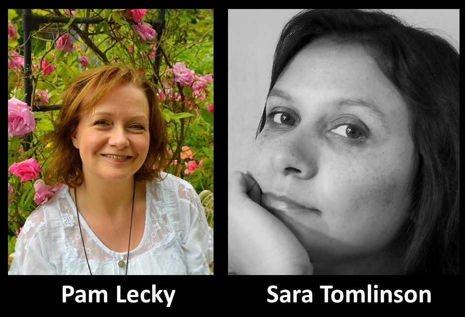
 Every book needs a cover, and a bad one can ruin the prospects of an otherwise excellent book. I recognised this when I embarked on writing seriously – in my case the Dawlish Chronicles Series of naval adventures set in the Late Victorian era and I realised that I would need the services a professional cover designer. The relationship between and author and a designer is a complex one, involving much sharing of ideas, willingness to listen and experimentation. Author Pam Lecky has been running a historical fiction book cover competition each month and in September 2017 the cover for my novel, “Britannia’s Amazon”, designed by Sara Tomlinson, was awarded the accolade of Cover of the Month. (Link to the blog post: http://bit.ly/2CyV6SN). Since cover-design is of interest to all writers I thought it would be of interest to ask Pam to interview Sara and myself about the process – so over to Pam. I hope your find the questions and answers of interest.
Q. Pam Lecky: A book cover is the author’s shop window and the first point of contact, very often, with potential readers. What do you consider the most important element of a cover with this in mind?
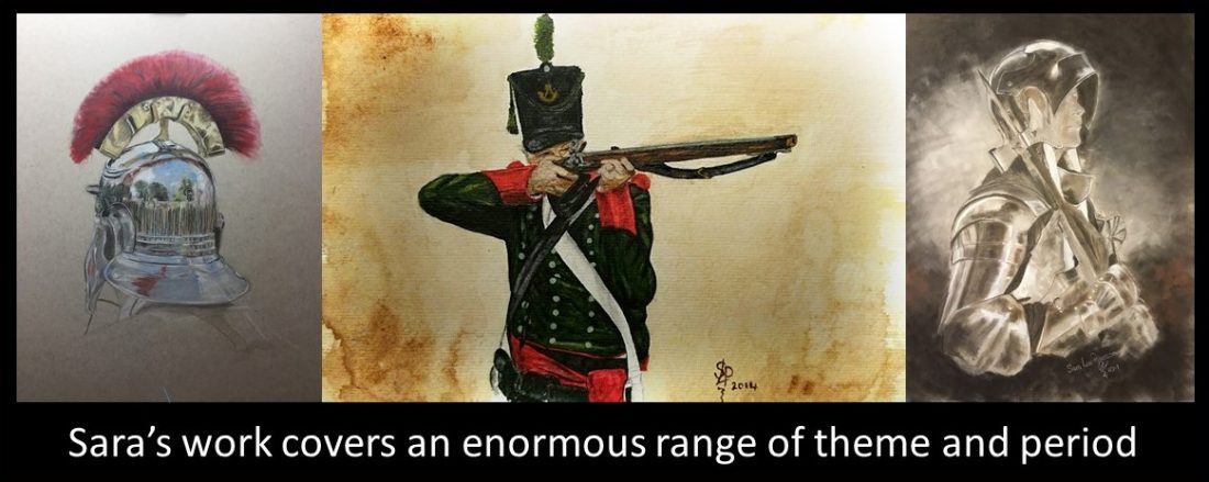
A. Sara Tomlinson: The most crucial element to me as a designer is impact and this usually comes in the form of an image. Most often this image is central to the narrative and therefore a clear indication as to what the story is about. This is the basis to all my designs but it must be engaging, have a function and most importantly be visually appealing. With Antoine’s books, the theme is constant but the image and tone vary considerably from book to book.
A. Antoine Vanner: On-line sales through Amazon or others can only show the cover in little over postage-stamp size. Everything that Sara says must work on that scale. In the case of a series, as with my own books, there should ideally be some commonality of style, such as in placing of title, choice and size of fonts, author’s name, layout of text blocks on the rear cover etc. Standardised lettering is especially important for the spines so that when a reader collects the entire series there is a pleasing commonality of style, even if the base colour changes. In this respect I also like hard copies to be in Six by Nine format, so that they can look good on a bookshelf and be comfortable to hold, books that are worth keeping as a set rather than being thrown away when finished. I was rather flattered just yesterday when a reader asked me to sign his collection of all six.
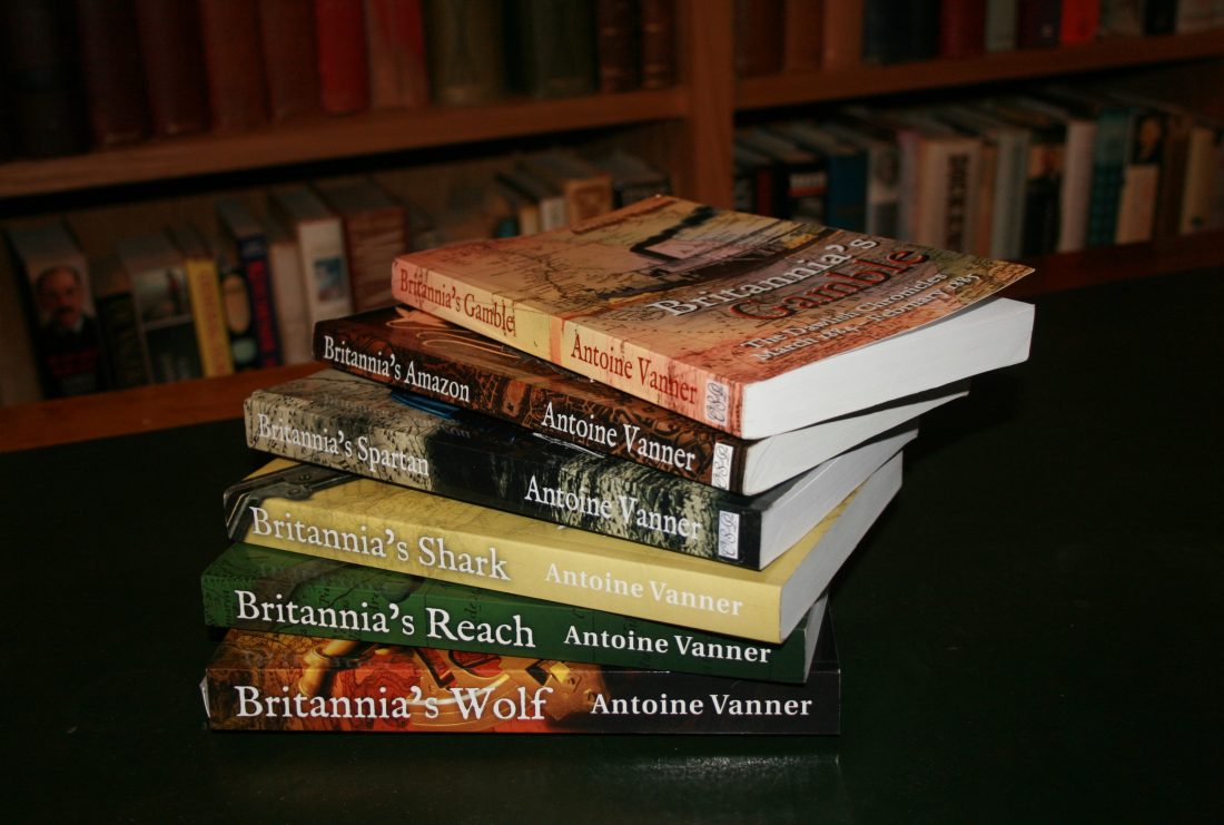
The six Dawlish Chronicles so far – and more on the way
Q. Pam Lecky: Most genres of fiction tend to produce similar themes in the covers. For instance, crime fiction at the moment tends to have dark, stark backgrounds (blue in colour) with large blunt yellow text. As a designer and as an author does this mean you have to conform or is there still room for creativity and originality?
A. Sara Tomlinson: It’s certainly true that book covers follow a trend fitting of their genre and this is a good selling tool, however it can also mean your book is indistinguishable. I try to move away from the usual clichés of book design but it can be difficult, and tempting to use these highly recognisable styles. When designing a cover for the Dawlish Chronicles, the overall layout and text style is already there, all I have to do is find the right images befitting the story. This is where my ‘creative powers’ come into play and the fun starts.
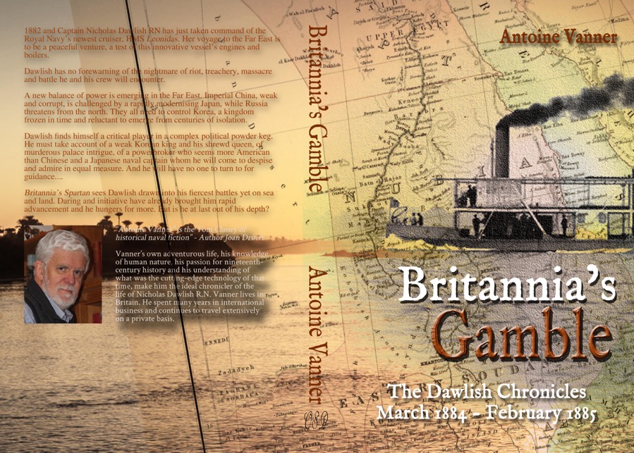
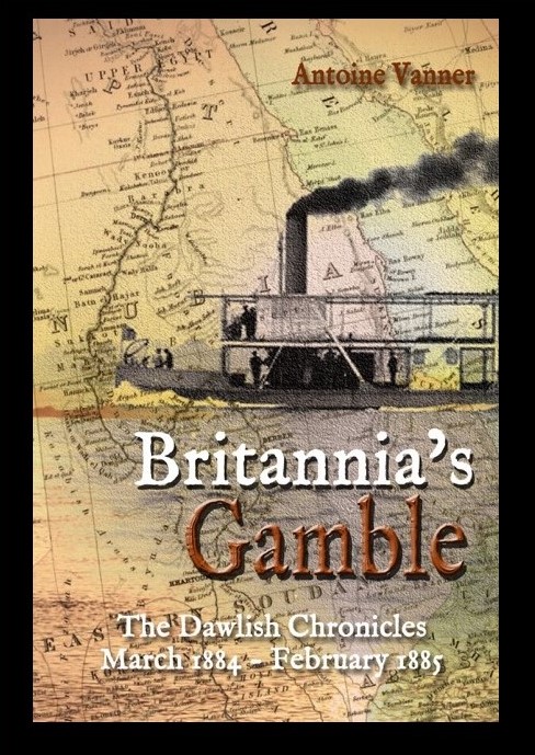
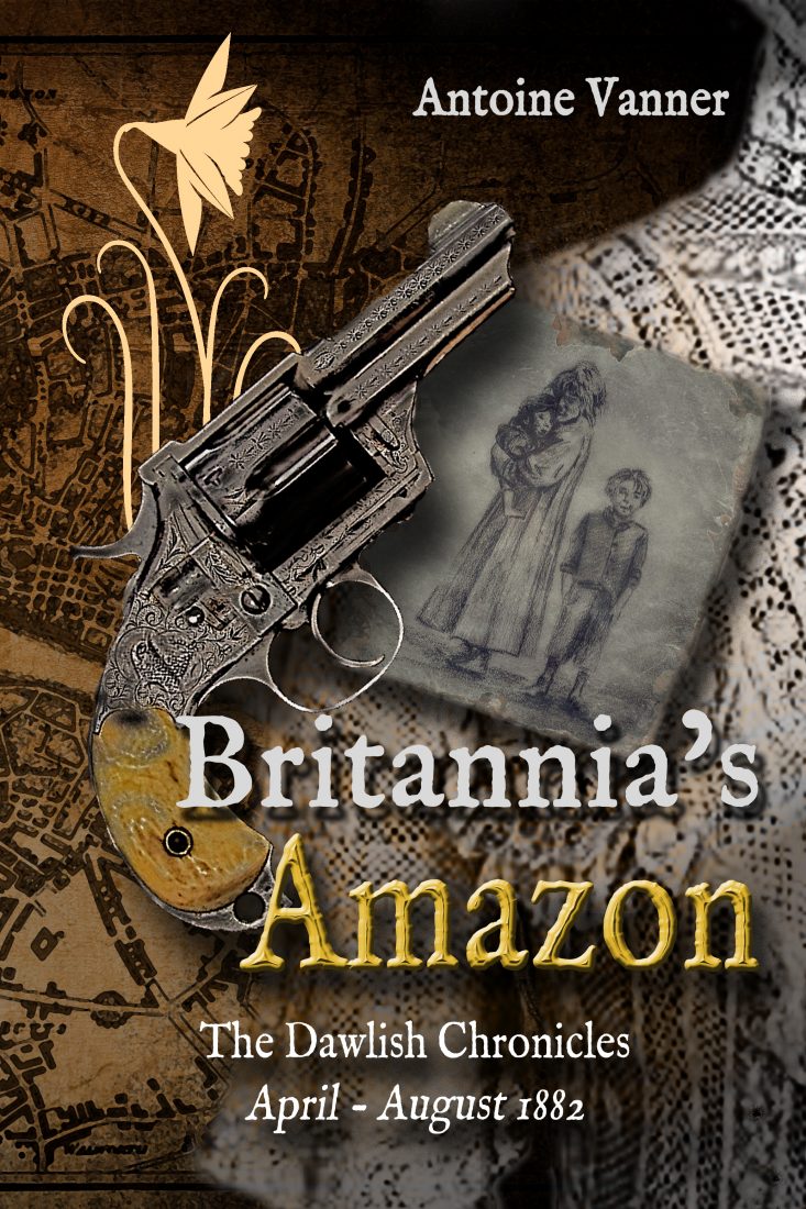 A. Antoine Vanner: The delight of working with Sara is that at the start of the process she’s prepared to come up with quick mock-ups in coloured pencil which help in shortlisting promising options. There may be as many as eight or ten, all at a “rough-cut” level. Each book uses a period map of the main scene of action as the background on to which the main image can be super-imposed. Both Sara and I myself suggest such images but it’s only when we see the mock-ups that we see which might really work when superimposed on the map. Sara is willing to go to amazing lengths to deliver quality. An example is the cover of “Britannia’s Amazon” – which won the “Historical Fiction Cover of the Month” award for September 2017. It’s the only book in the series, so far, to be written from a female viewpoint, and the challenge was to convey a combination of femininity, violence, poverty and decadence, the latter hinted at by the Art Deco lily. The lady’s revolver was a key image. We found photographs of such a revolver, but we couldn’t access a licence. Sara accordingly PAINTED a revolver, with considerably more ornate decoration, the sort of weapon that any self-respecting Victorian heroine would be glad to secrete in her reticule or muff. It’s hard to believe that it’s a painting and not a photograph.
Q. Pam Lecky to Sara: I’m sure many authors have very set ideas about what they want their cover to look like. How hard do you fight for your design if a client doesn’t like it?
A. Sara Tomlinson: my role as designer is not, as I see it, to design for myself. The author has to love what I’ve created and for them to have some involvement in that process is very important to me. Antoine is great at providing me with excellent material and information before I start. He sets the mood, the location, he tells me key points in the story and gives some input as to what he’d like to see on the cover. All this provides a base on which to start but during the design process it can often become necessary to impart my ‘wisdom’ as a graphic designer. Antoine is very open to that and that’s what makes working with him so enjoyable.
Q. Pam Lecky to Antoine: As an author I’m sure you have ideas about how you want your books to look. Has your experience with Sara opened you up to something a little different or do you fight for your ideas no matter what? (I assume you resist pistols or swords at dawn to settle your differences!)
A. Antoine Vanner: I’m a strong believer in accepting the advice of experts in areas in which I have no significant skill myself. I may ask for clarification but I would never reject suggestions or advice out of hand. The open discussion with Sara is a key part of the process and through it we’re always got to a satisfactory final design. “Britannia’s Gamble” was a case in point – I had various ideas about the cover’s main image, but when we tried them out they didn’t work. We tried again – other image possibilities – and even when we settled on the preferred image we tried several different ways of employing it. The result was one of our best covers. It would never come about had I not been willing to listen to the design expert!
Q. Pam Lecky to Sara: How do you ensure impact, bearing in mind what the potential buyer often only sees is a thumbnail picture of the cover when scrolling through the likes of Amazon on their phone or tablet?
 A. Sara Tomlinson: This is foremost on my mind when creating a cover. If it is too full, it can look like a confused mess to someone scrolling through potential books. It’s also important that the title at least can be read but inevitable the image design is going to be the first pull to a reader so it has to look as good small as it does large. Quality is also important, resolution should be sharp so the edges appear crisp and bright. Poor quality does not create impact.
Q. Pam Lecky to Sara: Is it difficult or easier when you are designing for a series, such as Antoine’s? What elements are most important to convey a sense of continuity?
A. Sara Tomlinson: Antoine’s series has been running for some time now so keeping that continuity is important, not just for regular readers but for new ones too. One book may well lead them to read further and recognising the cover style goes a long way in creating that sense of ‘series’. Each of the Dawlish books feature the same font and text placement, and each feature a map overlay in the background. Get these elements right and your half way there, finding and blending images within this becomes the real challenge.
The back cover is as important as the front – and an essential feature of hard copies
Q. Pam Lecky to Antoine: Does being an independently published author give you a greater awareness of the importance of a great cover?
A.Antoine Vanner: I guess that nowadays every author, however published, has got to spend a major portion of their time on promotion. Getting the cover right is a major part of that, but as an indie one starts out with little insight into the finer points of cover design. I was lucky to encounter Sara – indeed I became aware of her, via Face Book, not as a cover designer, but as an artist who takes on commissions. I was impressed by drawings she had shown on her page so I contacted her to ask if she would also do covers. And the rest is history.
Q. Pam Lecky: Unfortunately, many Indie authors go the DIY route when faced with the cost of good cover design. A quick scroll through Amazon will confirm this. We all know a great cover when we see it so what makes a bad one?
A. Sara Tomlinson: Lack of any imagination makes for a dull cover. As a graphic designer there are many issues to consider when piecing together a good book cover, issues that perhaps some Indie authors don’t even consider. Text colour and size is just as important as the images you want to use, even the placement is worthy of some thought. Moving something a little to the left or right can change the whole mood of even the most simplistic of covers. Sounds easy but it’s not!
A. Antoine Vanner: Sara’s answer nails this perfectly. Even when the right image is identified, the way it is used must be for best effect – e.g. in its entirety, cropped, various positions, extending across the spine etc. etc. Account needs also to be taken of the blurb and author-bio text on the back cover – it doesn’t show on the Kindle version but is of aesthetic importance for hard copies. Were I to go the DIY route I’d never get such quality – I know my limitations!
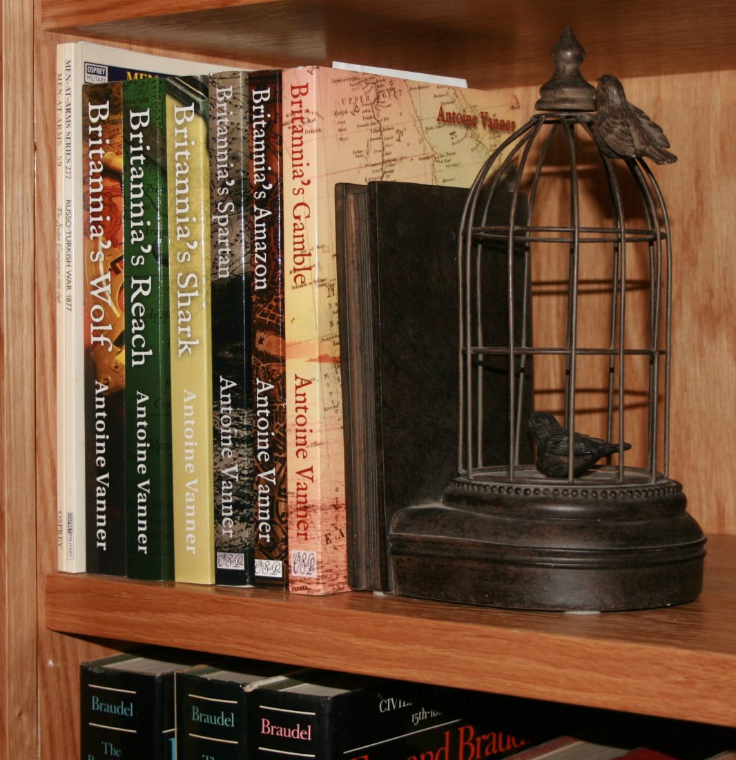
This cover emerged after some ten different concepts were considered
Q. Pam Lecky: There is a huge market in premade eBook covers and they vary considerably in price. Do you believe there is value out there – and are they still preferable to the DIY cover with the badly photo-shopped images?
A. Sara Tomlinson: Pre-made covers are certainly better quality and provide ‘human’ models that aren’t often available to DIY Indie authors. Certainly a benefit to some but there’s no guarantee that the cover is exclusive to you. I give a personal service, I allow you input and a cover that no one else has.
A. Antoine Vanner: Once again, “Go with the expert!” Each book one publishes is a major event in one’s life. It’s worth producing the best possible product in every way.
Q. Pam Lecky: Is it fair to judge a book by its cover???
A. Sara Tomlinson: Absolutely! I’m a little biased I suppose but I love books and the cover is the first thing that appeals to me. If I’m in a bookshop for example and I see a great cover, I’ll pick that book up……the next thing that sways me to make a purchase is the story synopsis. It’s possible I’m missing some great reads but if the cover doesn’t do it for me then I don’t even bother to find out what it’s about. So yes, I would say I DO judge a book by its cover.
A. Antoine Vanner: Next to word of mouth (or word of social media) the cover is the most powerful single marketing tool. If it doesn’t ring a bell on first sight, then it’s unlikely that the potential reader will bother about finding out more either then, or when they see it subsequently.
Q. Pam Lecky: And what’s next?
A. Antoine Vanner: I’m well into the first draft of the next, the seventh, Dawlish Chronicles novel. I haven’t revealed to Sara yet what it’s about or where it’s set. All I can say is that the cover will be a challenge – but I’ve no doubt that once again Sara will be delivering quality!
Pam Lecky is an award-winning Irish historical fiction author, writing crime, mystery and romance. She is a member of the Historical Novel Society and has a particular love of the late Victorian era/early 20th Century. Her debut novel, The Bowes Inheritance, was published in 2015 and was awarded the B.R.A.G Medallion; shortlisted for the Carousel Aware Prize 2016; made ‘Editor’s Choice’ by the Historical Novel Society; long-listed for the Historical Novel Society 2016 Indie Award; and chosen as a Discovered Diamond Novel in February 2017. Her next novel, No Stone Unturned, a Victorian mystery/crime novel, will be published in 2018.
Pam’s Link: www.pamlecky.com
Sara’s Link: leedesign@sky.com.
Check out Sara’s FB page to see samples: http://bit.ly/2EdbGbf
Antoine’s Link: dawlishchronicles@outlook.com and www.dawlishchronicles/com